


-
Topics
-
-
Our picks
-

Going back to its origins: World premiere of the all-new Toyota Land Cruiser
Toyota Owners Club posted a record in Toyota News & Articles,
Toyota today proudly reveals the all-new Land Cruiser, a model that draws directly on the original qualities that have made the Land Cruiser name synonymous with strength and reliability for more than 70 years

Picked By
Toyota Owners Club, -
-

Toyota Gazoo Racing prepares for historic centenary edition of the Le Mans 24 Hours
Toyota Owners Club posted a record in Toyota News & Articles,
Toyota Gazoo Racing will contribute to another chapter in the history of Le Mans when they take on a record Hypercar field in the centenary edition of the world’s most famous endurance race next week (10-11 June)
Picked By
Toyota Owners Club, -
-
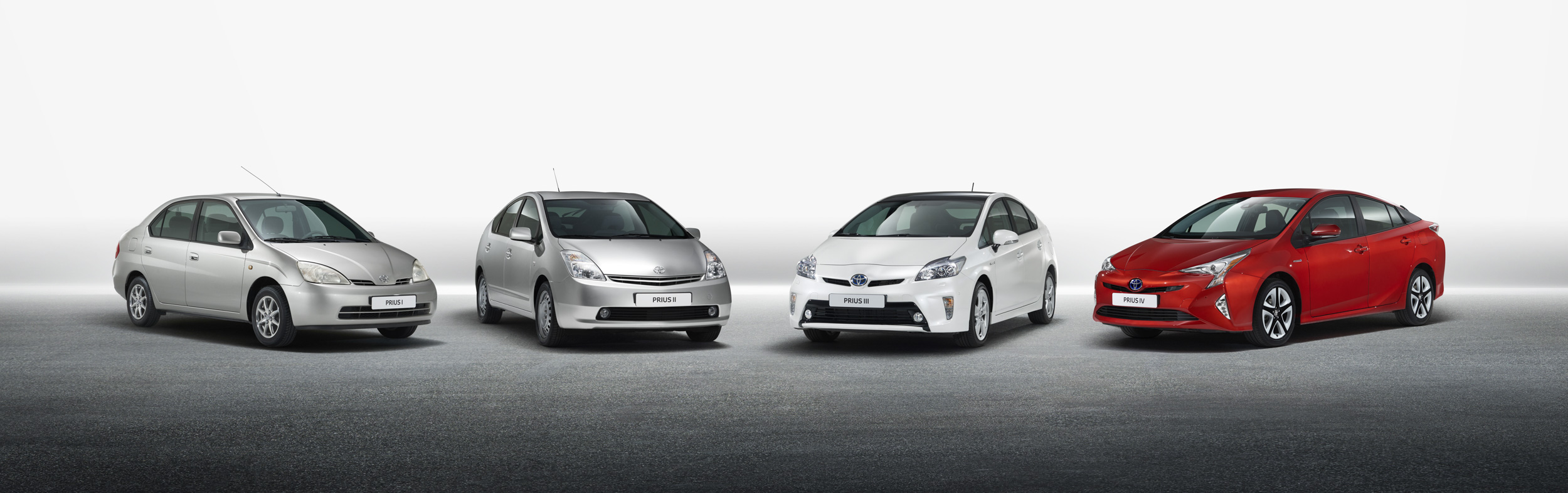
Toyota Prius honoured with lifetime achievement award
Toyota Owners Club posted a record in Toyota News & Articles,
The Toyota Prius’s status as the pioneer that paved the way for today’s electrified vehicle market has been recognised with a lifetime achievement award in the TopGear.com Electric Awards 2023
Picked By
Toyota Owners Club, -
-
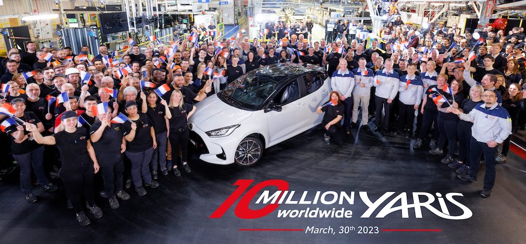
Toyota Yaris reaches the landmark of 10 million global sales
Toyota Owners Club posted a record in Toyota News & Articles,
The ever-popular, multi-award-winning Yaris* nameplate has reached 10 million cumulative worldwide sales, performance which earns it a place alongside Toyota’s illustrious eight-figure achievers – Corolla, Camry, RAV4, Hilux and Land Cruiser
Picked By
Toyota Owners Club, -
-

Toyota develops THUMS crash test simulation software in preparation for automated driving
Toyota Owners Club posted a record in Toyota News & Articles,
Toyota has announced further development of THUMS (Total Human Model for Safety), its software programme for computer simulation and analysis of the injuries resulting from vehicle crash impacts. The latest advances take account of changes in people’s posture when taking advantage of automated driving systems
Picked By
Toyota Owners Club, -
-


Recommended Posts
Toyota Official Store
Sponsored Ad
Name: eBay
Toyota Model: Toyota Store
Toyota Year: 2024
Latest Deals
Toyota Official Store for genuine Toyota parts & accessoriesDisclaimer: As the club is an eBay Partner, The club may be compensated if you make a purchase via eBay links
Join the conversation
You can post now and register later. If you have an account, sign in now to post with your account.